
Responsive Web Design for an Ecommerce Site
-
The Goal
To create a user-friendly responsive website for an ecommerce platform in which users can buy and sell their gaming equipment. The design should reflect the brand’s ethos while delivering a smooth, easy to navigate experience for its users.
-
The Process
Building on the user research from the Mod Vault app, I began with paper sketches for the desktop layout and low-fidelity wireframes in Figma for both desktop and mobile. I then moved into UI design, creating high-fidelity mockups and interactive prototypes, incorporating imagery from Unsplash and copy generated with ChatGPT.
-
The Solution
The solution was a fully responsive ecommerce site for Mod Vault that delivers a seamless experience across desktop and mobile. The design balances functionality with a clean, modern UI, making it easy for users to browse, buy, and sell gaming products. By applying user research insights, the final product improves usability, enhances visual appeal, and supports intuitive navigation throughout the shopping journey.


User Research
To review the in-depth user research, please review the previous case study in my portfolio on the Mod Vault app. The same user research, personas, and user journeys were applied to this design.
Paper Wireframes
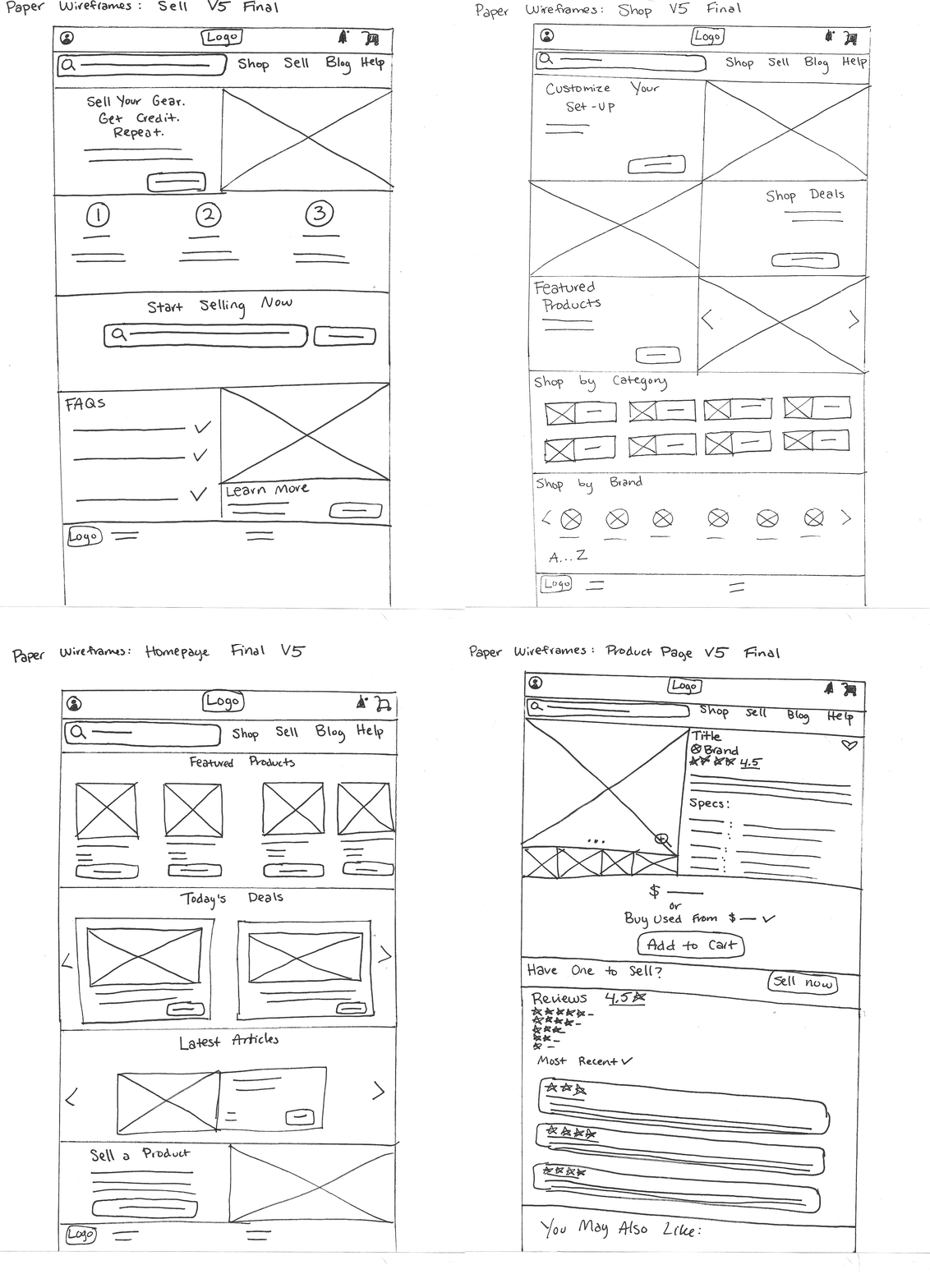
The ideation process started with paper wireframing. I designed some of the most important screens on paper first to develop several quick iterations and narrow down the best user-centered solutions before going digital.
Low Fidelity Prototype
I then transferred the paper wireframes to low fidelity wireframes in Figma to create a working prototype.
Design System
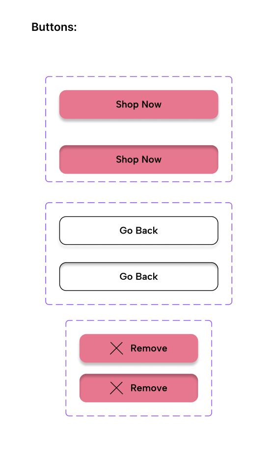
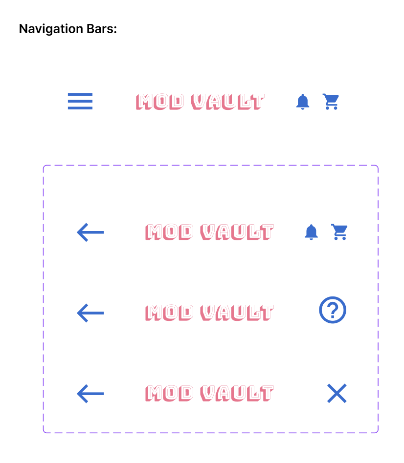
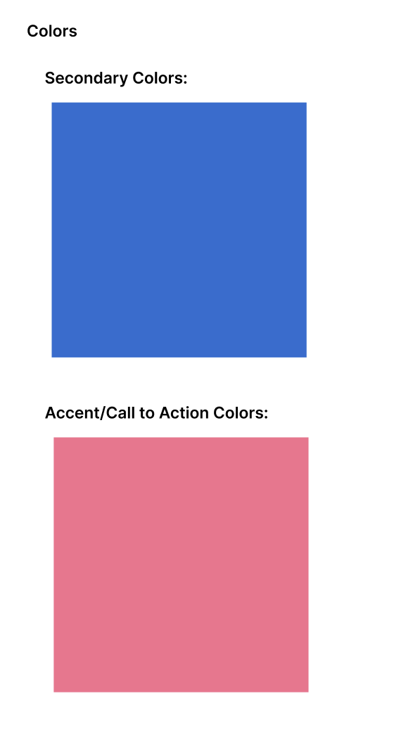
The design system was synthesized with the help of ChatGPT to determine complementary typography, Coolors.Co to develop a complementary color palette, and iconography from Google’s design system Material Design. Unsplash was utilized for product imagery and ChatGPT was used for product pricing and descriptions.



High Fidelity Prototype
Buying a Gaming Product
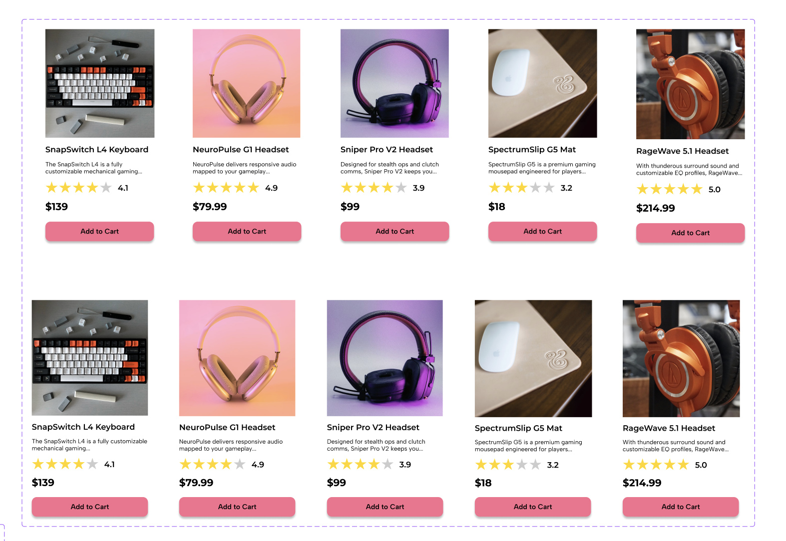
When users search for a product, the results display with subtle hover animations that highlight the item being selected. After clicking “Add to Cart,” an overlay appears, showing the items currently in the user’s cart. Users can also hover over the cart icon to quickly preview their selections without leaving the page. On each product page, a “Buy Used” option allows shoppers to view an overlay with multiple listings sorted by price and quality—giving them the flexibility to choose a used product instead of purchasing new.
Selling a Gaming Product
Users move through a step-by-step flow to sell an existing product. They begin by selecting an item from search results displayed as interactive chips with product names, images, and descriptions. Next, they enter details such as purchase year, quality, and shipping ZIP code. Users then choose between shipping or pickup options—each expanding to show relevant fields like nearby drop-off centers or pickup scheduling. After confirming, they see their calculated store credit with a celebratory confetti animation to reinforce a positive experience. Finally, a confirmation screen with a checkmark animation and “Continue Shopping” button completes the process.
The Checkout Process
Users follow a clear, step-by-step flow to complete their purchase. The process begins with a cart summary displaying items and interactive chips for available discounts, such as their wallet balance and rewards points. When a discount is applied, a confetti animation appears, highlighting the user’s savings, to reinforce the positive sentiment towards the money being saved. During checkout, users can quickly select saved addresses and payment methods through interactive chips or add new ones as needed. A final order summary allows for review before placing the order, which concludes with a confirmation screen and checkmark animation to signal success.
Next Steps
After launching the responsive website, our next step would be to measure our success by the following metrics:
Feature Usage Frequency (selling a gaming product)
Increased Traffic and User Retention
Increased Sales
User Surveys


