
Mod Vault: An E-commerce Gaming Product App
-
The Goal
To create an e-commerce app that will allow users to buy and sell used gaming equipment easily, which will affect budget-conscious gamers by giving them lower cost options, as well as giving them a seamless way to sell their existing equipment to upgrade their setup with ease.
-
The Process
I began with secondary research and a user survey to better understand the user problem, which subsequently informed the creation of user personas and problem statements. From there, I defined the goal and moved into ideation through storyboarding, site mapping, and wireframing. I developed low-fidelity prototypes in Figma and conducted usability testing to gather insights. These findings helped to shape the high-fidelity prototype, which was further refined after a second round of testing before arriving at the final version of the app.
-
The Solution
To address the needs of budget-conscious gamers who prefer to shop online, I designed an app that allows users to seamlessly buy and sell both new and used gaming products. The platform helps users save money, upgrade their setups conveniently, and avoid the hassle of in-person shopping or unreliable secondhand marketplaces.

-
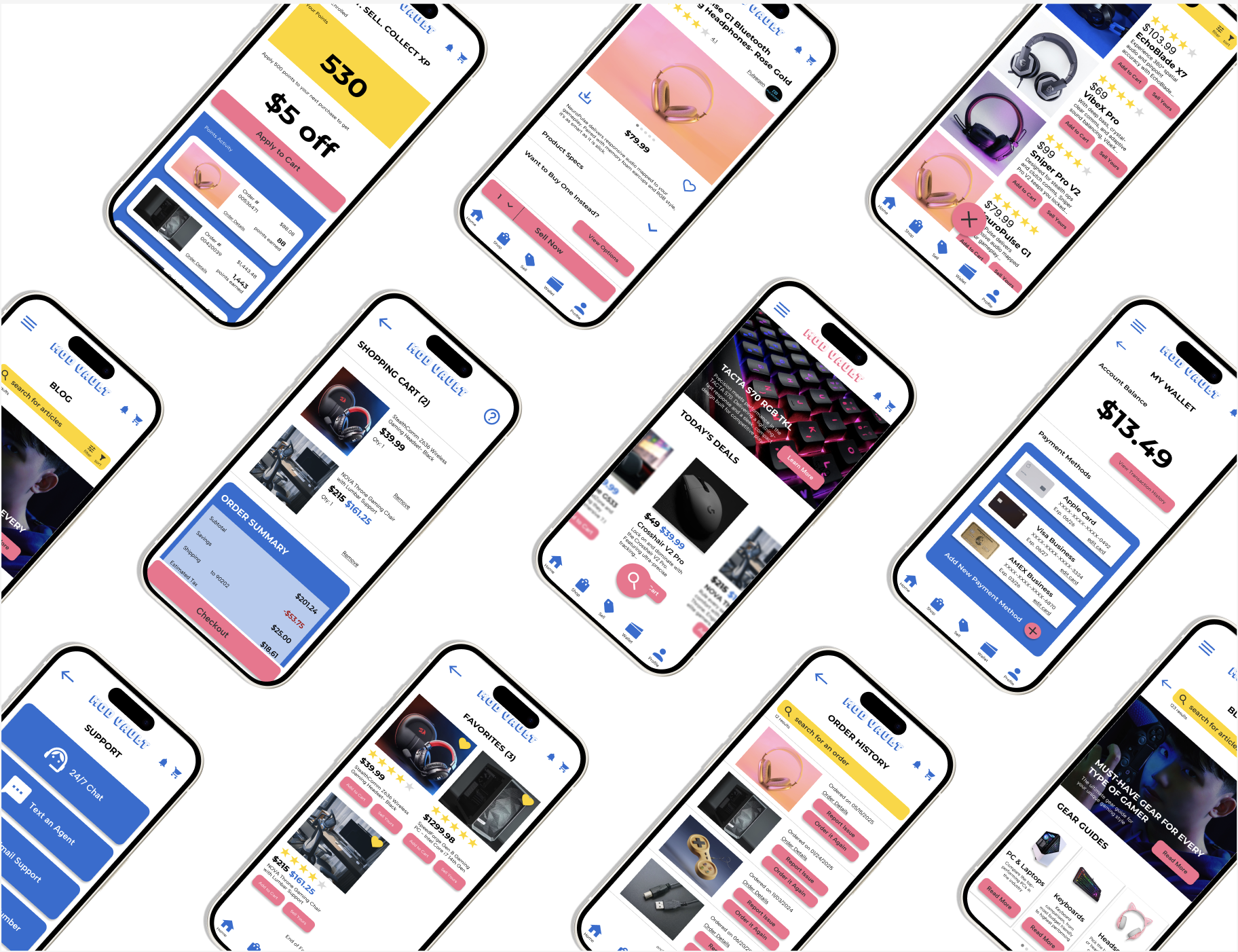
![Smartphone displaying an online shopping app for headphones, with a picture of rose gold gaming headphones, price $79.99, add to cart button, and navigation icons at the bottom.]()
Product Page
-
![Mobile phone displaying an online store called MOD VAULT with a gaming keyboard, gaming mouse, and other electronic accessories for sale.]()
Home Page
-
![Mobile app screen displaying a digital wallet with an account balance of $13.49, options to view transaction history, and three saved payment methods: Apple Card, Visa Business, and AMEX Business, with an option to add a new payment method.]()
Wallet
-
![Mobile phone screen displaying a gaming gear guide website with a header labeled "MOD VAULT," a search bar, and sections for PC & Laptops, Keyboards, and Headsets, each with a "Read More" button.]()
Blog


Empathize
Secondary Research
-
Gen Z (ages 11-26) has the highest rate of digital gaming in the U.S.
-
Women account for about half of gamers in the US
-
In 2023, 75 percent of video gamers in the United States identified as White, while 19 percent of responding gamers identified as Hispanic
Survey Demographics
The initial survey was conducted through Google Forms. Participants were contacted through social media, gaming Discord channels, and through the Google UX Course. Our target participants were gamers of all genders in any location, between the ages of 13 and 35.
Survey Findings
Do you prefer to buy gaming equipment online, or in person? Why?
53% of survey participants prefer to buy gaming equipment online, for the following reasons:
convenience
larger selection
customer reviews
less pressure
For the remaining participants who preferred to purchase at a physical brick and mortar store, these were their reasons:
legitimacy
assess quality of product in person
can get the product instantly
buy used to save money/ have to pick up the product in person
Where do you like to get your gaming equipment currently? Is there a specific company or companies you buy from?
40% said Best Buy
20% said Logitech
20% said Razer
13% said Wooting
13% said Amazon
What challenges do you face when buying gaming equipment?
33% said price + budgetary constraints
13% said no ability to try the product before buying
13% said over-sponsored reviews
13% said not enough color options to customize each product or complained about the aesthetics
less than 6% said gaming mice for left-handed people are hard to find
less than 6% said products selling out too quickly
less than 6% said lack of expertise or knowledge when comparing products
less than 6% said too many options
How often do you purchase new gaming equipment, such as a new console, keyboard, mouse, etc?
80% only purchase new gaming equipment once a year
13% purchase gaming equipment twice a year
Less than 6% of survey participants purchase gaming equipment more frequently than twice a year
Survey Testimonials
“I find people can be quite rude if they know a lot about the item and you are just starting.”
Female Participant, 19 from Australia
“I live in a really rural area so finding any used equipment that isn’t over priced and/or out of my budget can be difficult,”
Male Participant, 25 from Masssachusetts
“When I look for left handed mice, I'd like to not see ambi mice, especially those with buttons on one side. They cramp my hand”
Female Participant, 32 from Deleware
Empathy Maps

The creation of this aggregated empathy map based on data collected during the user surveys helped to establish the following pain points:
Inability to find lower cost gaming product options
Lack of customization options
Frustration in not being able to try products before buying
Overwhelmed by amount of options + the product knowledge required before making a purchase
Define
User Personas
Utilizing the user survey data and pain points identified in the empathy map exercise, I was able to create the following two user personas. The pain points and data are sorted into the personas primarily by age, gender, location, and socioeconomic status, due to trends that materialized in the user survey data.


-
Mateo, 31, is a sales manager living in Bakersfield, CA, with his spouse and two young children. He plays video games in his down time and needs high speed, high quality gaming equipment for a budget-friendly price. He prefers to shop for equipment in store as opposed to online, and would like to be able to test the equipment before buying since he is more budget conscious and really needs his gaming setup to be high quality and up to date. He would be open to buying pre-owned equipment, and would like an easy way to sell his old equipment before buying the new upgrade. He is also left-handed and would like to see more options for left-handed mice.
-
Chloe is a 20 year old Finance student living in Boston, Massachusetts with one roommate. Outside of school and her internship, she likes to spend time with friends and plays video games in her down time. She feels frustrated that the gaming world is very male dominated, and sometimes feels like she is being judged or not taken seriously when buying new gaming equipment, especially if she doesn’t have enough knowledge about the specific type of product. She has some extra money to spend and would love some more design and customization options for her gaming setup.
User Statements
“As a full-time sales manager and parent who plays video games in my down time, I want to be able to sell my old gaming equipment online before buying new gaming equipment, so that I can save money while still being able to upgrade to the new tech.”
— Mateo
“As a finance student and weekend gamer, I want to buy my gaming equipment online so that I can find more design and customization options, and avoid the gender discrimination and gatekeeping I often encounter when shopping in-store.”
— Chloe
Problem Statements
Creating problem statements is an incredibly important step to clearly define the specific needs, goals, and pain points of our target users. By understanding what motivates users like Mateo and Chloe, I was able to design a solution that directly addresses their challenges, ensuring a more user-centered and effective product.

Mateo is a budget-conscious parent of two who needs a website where he can easily sell his old gaming equipment and return new purchases. He wants to save money while upgrading to high-quality, up-to-date tech that meets his standards.

Chloe is a female gamer who needs a website to purchase customizable gaming equipment because she needs more design options for her gaming setup and doesn’t like the discrimination she tends to face in an in-store environment.
Ideate
Competitive Analysis
-
Indirect Competitor
Best Buy has a well-designed website and responsive app with comprehensive navigation, and many notable features including a 24/7 chatbot for support and a page for “today’s deals.” Their accessibility features could be improved, however, as the website is only available in English, and the product category images are small and cannot be expanded. The branding is cohesive and tells a clear story, but is not very compelling for a gamer. For the budget-conscious user, Best Buy excels in sales, lower cost product recommendations, and pre-owned/refurbished and product trade in options.
-
Direct Competitor
Razer has a more compelling web design for gamers specifically, and while they do not have an accompanying app, their mobile site is responsive and functions well. Razer offers notable features on their site, including a community for other gamers to communicate and ask questions, a page dedicated to customizable products, and informative blog pages describing differences between products and manuals on selecting the right product based on the user’s needs. Razer also excels in accessibility, offering their screen-reader compatible site in eight different languages, and featuring left-handed and ambidextrous gaming mice. The navigation is easy to use and intuitive, while the web design has cohesive branding and a modern, gamer-centric design.
I conducted a competitive audit to better understand the strengths and weaknesses of existing platforms where users can buy gaming products. This exercise helped identify gaps in the market that in turn informed opportunities to differentiate and improve my own design solution.
How might we?
-
How might we excite users about the money they’re saving on gaming equipment?
How might we create a process in which users can buy used gaming equipment?
How might we allow users to try products before buying?
How might we make buying and selling gaming equipment like a video game?
-
How might we make customizing gaming products like playing a video game?
How might we utilize personalized recommendations to assist in customization?
How might we make the shopping experience more inclusive for everyone, regardless of product knowledge?
For each problem statement, I conducted a “how might we” exercise, asking several “how might we” questions to address potential solutions for each user persona’s problem.
Prototype
User Flow
The first step in prototyping a potential solution to the established problems is to create a user journey, or user flow, to help inform next steps in the design process. I first created a list of steps each user would take to achieve their goal and solve their unique problem, before creating a visual representation as shown here.
-
![Flowchart illustrating the steps for selling a used product online, from searching for the product on the homepage, selecting it, entering product information, confirming details, and choosing shipping options.]()
Mateo's User Flow
-
![Flowchart illustrating a step-by-step process for customizing a product online, starting from opening the app, navigating menus, selecting products, customizing gear, choosing colors or patterns, confirming design, entering checkout information, and final order confirmation.]()
Chloe's User Flow


Paper Wireframes
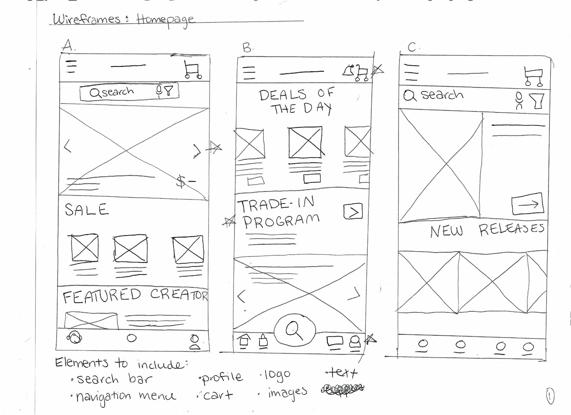
Paper Prototypes
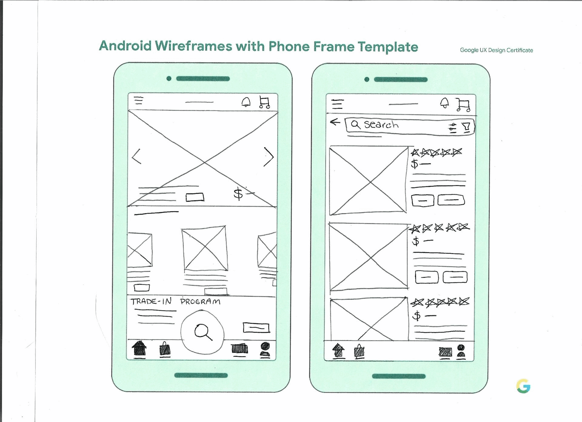
Low Fidelity Prototype

Test
Methodology
Unmoderated usability study
Location: United States, remote (participants will go through the usability study in their own homes)
Dates: Sessions will take place on April 10 and 11
Five participants will receive a link to the prototype and a brief introduction and instructions. They will record their screen as they attempt to a sell a gaming product on the app. Afterwards, they will send the video to the study conductor and will answer follow up questions regarding their experience with the app.
Participants
Participants will be avid, budget-conscious gamers who purchase gaming equipment online at least once every couple of months.
Participants will be recruited online and given a screener survey before being asked to participate in the study
4 female, 1 male aged 23-30 years old
1 user of assistive technologies (keyboard, screen reader)
Incentive: $10 cash via Venmo or Zelle
KPIs
Time on task
Use of Navigation vs. Search
User Error Rates
System Usability Scale (SUS)
Introduction
Title: Creating an app to buy and sell gaming equipment
Author: Clare Yeaw, UX Designer, clareyeawbusiness@gmail.com
Stakeholders: App Users & Customers
Date: 4/9/2025
Project background: We’re creating an app to help people buy and sell gaming equipment, so customers have access to lower cost options and can trade in their older equipment for newer upgrades.
Research goals: Find out if it’s simple and easy for customers to sell their gaming equipment on the app.
Research Questions
How long does it take for a user to sell their gaming equipment?
What can we learn about the steps the user takes to successfully sell their gaming equipment?
How does the user feel about the functionality and usability of the app?
What does the user feel when trying to complete this user flow?
How many steps does the user take to successfully complete the user flow?
Usability Testing Research Plan

Affinity Diagram
Research Patterns
-
It was observed that 4 out of 5 participants did not know where to go to sell a gaming product. This means that the feature to sell your own gaming product is difficult to find for almost all users. Users need a more intuitive way to start the process of selling a gaming product.
-
It was observed that 2 out of 5 participants wished there was a way to find products & categories in the navigation menu. This means that some users prefer to shop & find products via the navigation menu, but not an overwhelming majority. Users need an ability to find & shop for products via the navigation menu.
-
It was observed that 3 out of 5 participants wished there was a separate page or button for selling gaming products, instead of only being nested within specific product pages under the Shop page. This means that most users would prefer a separate page or button for selling products. Users need a new section for selling a gaming product, separate from the existing “Shop,” page.
Insights
1
Users need an ability to find & shop for products via the navigation menu.
2
Users need a new section for selling a gaming product, separate from the existing “Shop,” page.
3
Users need a more intuitive way to start the process of selling a gaming product.
Implement
Revised Low Fidelity Prototype
-
![]()
Navigation Bar
A “Sell,” button was added to the navigation bar to give users another “door,” at which to access the “sell a used gaming product,” user journey.
-
![Comparison of mobile app menu with expanded 'Shop' section showing categories: Shop by Category, Shop by Brand, Sale & Clearance, Customizable Products, and New Releases.]()
Navigation Menu
More specific shopping categories were added to the Navigation menu for users who tend to use Navigation vs. Search to access products.
-
![Comparison of two mobile app screens; left shows an option to sell a product, right shows an option to buy a product, with buttons labeled 'Sell Yous' and 'Sell Now' highlighted in red.]()
Product Page
A separate product page was created for users who are trying to sell their product as opposed to buying a product. There is a button users can tap to take them to the product page where they can purchase the product if needed.
-
![Comparison of a mobile shopping app interface before and after adding a search bar and sell button. The left side shows a basic interface with a search icon, account icons, product listings, and navigation menu. The right side shows the same interface with a red outline around the search bar labeled "search for your product" and a prominent "Sell Now" button added below the product listings.]()
Search Results
A separate page, modeled after the “search results” page nested under the Shop feature, was created for users to search for the product they would like to sell. Instead of “search,” the text within the search bar now says “search for your product,” for better understanding of this page’s function.


Design System
The design system was synthesized with the help of ChatGPT to determine complementary typography, Coolors.Co to develop a complementary color palette, and iconography from Google’s design system Material Design.


High Fidelity Prototype

Users can sell their gaming equipment through a dedicated button in the navigation bar, or through the navigation menu.
From there, they can search for their specific product and indicate the year they purchased it, the quality of the product, and their location to help determine the amount they will be reimbursed.
Once this information is confirmed, users will be see a congratulatory confirmation screen with the amount of money that will be added to their account wallet after the product is received.
Selling a Product

Once users have confirmed the sale of their gaming product, they can select between shipping or pickup.
They can search for nearby shipping centers before selecting shipping or pickup to help them make that determination.
If scheduling a pickup, they can select an available calendar date and pickup window based on their address. There is also a box to input delivery instructions in case their address is difficult to find.
Select a Shipment Method

Under the product page, there is an option to Buy New, which is the default option. This price is centered underneath the product image and the button to add the new product to the user’s cart is on the bottom of the screen.
However, there are also options to Buy Used, separated out by cost and subsequent quality level. This is incredibly helpful for users who may want a slight discount, but still want a “Like New,” product, or for users who want the cheapest option and don’t mind if the quality is only “Fair.” I also included the quantity of each available in case users are looking to buy multiple.
Buy Used Gaming Products

There is a blog page that users can access through the navigation menu, with featured articles from Mod Vault staff and gear guides to help make unbiased product recommendations to users. This can help bridge any product knowledge gaps for all users.
Under the navigation menu and within the Shop tab, users can shop by New Releases, Sale & Clearance, Best Reviews, and Customizable Products. These more personalized shop categories will help users fulfill their specific needs, whether it be budget constraints, prioritizing highly rated products, or aesthetic reasons such as customization.
Blog & Product Recommendations
Another usability study was conducted for the high fidelity prototype, with the same research goals and questions. Here’s how the results stack up compared to the previous usability study.
High Fidelity Prototype Testing
Users can now sell gaming products with ease.
In the first usability study, most users could not figure out how to sell a used gaming product (80%). With the high fidelity prototype, all users were able to complete this prompt with ease.
Users find the app easier to use.
100% of users agreed that the app was easy to use, while only 60% agreed in the previous usability study.
Users find the app easier to navigate.
100% of users strongly agreed that the app was easy to navigate. In the previous usability study, only 20% of users strongly agreed that the app was easy to navigate.
Users felt more confident using the app.
After analyzing the responses in the SUS (System Usability Scale), 100% of users agreed that they felt confident using the app versus the 80% of users who agreed in the previous usability study.
Users felt that the app was less complex.
In the previous usability study, only 40% of users strongly disagreed that the app was unnecessarily complex. Now, 100% of users strongly disagreed, showing that users feel that the app is less complex than before.
Users find the app less consistent.
When asked if there is inconsistency within the app, 66% of users disagreed, but 33% agreed. In the previous usability study, 100% of users disagreed that there was inconsistency within the app.
Next Steps
After testing the high fidelity prototype, there were no major insights or concerns, so only a few aesthetic and functionality changes were made at this stage. If Mod Vault were a real company, our next step would be to launch the app and measure our success by the following metrics:
Feature Usage Frequency (selling a gaming product)
App Reviews
Increased Traffic and User Retention
Increased Sales